
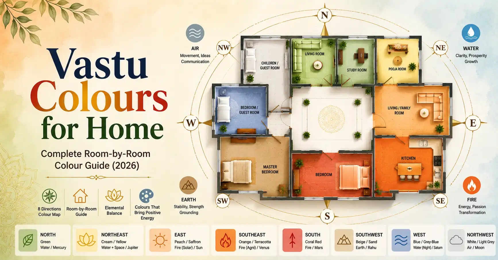
What you will learn in this guide
- The elemental logic behind Vastu colour — why specific colours belong in specific zones
- Correct wall colours for every room — bedroom, kitchen, living room, pooja room, study, entrance and bathroom
- Direction-based colour map — what colour each of the eight directional walls should carry
- Colours to avoid in each room and why — not rules without reasons
- How to apply Vastu colours in rented homes and apartments where full repainting is not possible
Colour in Vastu Shastra is not interior design — it is elemental medicine. Every colour in the classical system corresponds to a planet, an element, a directional energy and a quality of consciousness. Placing the right colour in the right zone reinforces the elemental energy that zone is supposed to carry. Placing the wrong colour creates a subtle but persistent elemental dissonance — the space looks fine but does not feel right, in the way that a room lit with the wrong colour temperature looks complete but feels slightly off.
This is why Vastu colour guidance exists — not because ancient practitioners had opinions about aesthetics, but because they understood that colour, as wavelength of light, directly interacts with the energetic quality of a space. The Brihat Samhita and Manasara both contain specific colour prescriptions for different rooms and directions. This guide translates those prescriptions into practical room-by-room and wall-by-wall guidance for the modern Indian home.
The Elemental Colour Logic — Understanding the System First
Before applying individual room colours, understanding the underlying logic helps you make better decisions when exact prescriptions do not fit your situation. Vastu colour is rooted in two parallel systems:
The Navagraha (planetary) system: Each direction is governed by a planet, and each planet has a primary colour. North is Mercury — green. East is Sun — orange and gold. Southeast is Venus — white and silver. South is Mars — red. Southwest is Rahu — dark blue and black (which is why SW is never painted these colours in residential use — it amplifies heavy, inert energy). West is Saturn — blue and grey. Northwest is Moon — white and silver. Northeast is Jupiter — yellow and gold.
The Pancha Bhuta (five element) system: Each zone carries a primary element, and elements have colour associations. Earth (SW) — yellow, brown, ochre. Water (NE, N) — blue, green, white. Fire (SE, S) — red, orange, pink. Air (NW) — white, light grey, silver. Space/Ether (centre — Brahmasthan) — transparent, white, very light tones only.
Where the two systems agree — as they do for most zones — the colour prescription is clear. Where they diverge, the elemental system generally takes priority for wall colours, while the planetary system guides accent colours and decorative elements.
Classical reference: Brihat Samhita (Chapter 58, “Griha Varna Vidhi” — House Colour Rules) states that rooms should be coloured according to the elemental nature of their zone — “agni zone rooms in rakta varna” (fire zone rooms in red tones), “jala zone rooms in shukla or harit varna” (water zone rooms in white or green tones), “prithvi zone rooms in pita varna” (earth zone rooms in yellow tones). The Manasara reinforces this and adds planetary colour associations for entrance doors and external walls.
The Eight-Direction Colour Map
The most practical starting point for any home is a direction-by-direction colour assignment. This map tells you what colour the wall facing each direction — or the room occupying each zone — should carry.
| Direction / Zone | Element | Planet | Primary Wall Colour | Accent Colours | Avoid |
|---|---|---|---|---|---|
| North | Water | Mercury | Green, light green, sea green | Blue-green, white | Red, dark orange |
| Northeast | Water + Space | Jupiter | White, light yellow, cream | Light gold, pale blue | Red, dark colours |
| East | Fire (solar) | Sun | Light orange, peach, saffron | Cream, warm white | Blue, black |
| Southeast | Fire (Agni) | Venus | Orange, coral, terracotta | Red accents, copper tones | Blue, dark green |
| South | Fire | Mars | Red, terracotta, warm pink | Coral, earthy orange | Blue, black, white |
| Southwest | Earth | Rahu | Beige, light brown, ochre, cream | Warm yellow, sandy tones | Blue, black, bright white |
| West | Water (night) | Saturn | Blue, grey-blue, silver-grey | White, light indigo | Bright red, deep orange |
| Northwest | Air | Moon | White, off-white, light grey | Silver, pale cream | Dark, heavy tones |
This map is the foundation. The room-by-room guide below applies this map to specific rooms, adding function-specific adjustments where the room’s use requires a refinement on the pure zone colour.
Bedroom Colours — Zone-Specific and Sleeping Direction Rules
The bedroom is the room where colour has the most direct impact on sleep quality, relationship harmony and morning energy. The correct colour depends on which zone the bedroom occupies.
Master bedroom in the Southwest zone — Earth colours
The southwest master bedroom should carry earth element colours — light beige, warm cream, ochre yellow or sandstone. These colours reinforce the SW zone’s stability and grounding energy, producing the quality of deep, consolidating rest that the master bedroom is supposed to provide. Avoid bright or stimulating colours — red, bright orange, electric blue — in the SW bedroom. They activate rather than settle the earth zone.
Wall colour recommendation: Warm beige or cream with one ochre accent wall (ideally the wall behind the headboard, which should be on the south or west wall).
Children’s bedroom in the Northwest zone — Air colours
The northwest carries air element energy — movement, social activity, study and growth. Children and young adults in the NW bedroom do well with white, off-white or very light green walls. These colours keep the room feeling fresh, active and mentally stimulating without being overstimulating. Avoid heavy, dark colours in children’s NW bedrooms — they suppress the air element’s natural vitality.
Wall colour recommendation: Off-white or very light green with pastel accents appropriate to the child’s age and preference.
Guest bedroom in the Northwest or West zone
Guest rooms benefit from the air element’s welcoming, social quality. White, light grey or very light blue are appropriate for northwest and west zone guest rooms. These are neutral, welcoming colours that suit visitors without imposing the strong elemental energy of the SW earth zone on people who do not live in the home permanently.
For the complete guide to bedroom placement, bed direction and sleeping position colours see our Master Bedroom Vastu Guide.
Kitchen Colours — Southeast Fire Zone
The kitchen occupies the southeast fire zone. Its colour should reinforce the fire element — activating, energising, appetite-stimulating. The classical colour prescription for the kitchen is the most specific of any room in the Brihat Samhita’s colour chapter.
Primary kitchen wall colours: Orange, coral, terracotta, warm red, saffron yellow. These are fire element colours that align with the Agni zone’s energy and are simultaneously appetite-stimulating and energising for the act of cooking.
Platform and tile colours: The cooking platform and backsplash can carry slightly lighter versions of the same fire spectrum — cream with orange undertones, warm terracotta tiles, coral mosaic. The floor can be neutral — cream, light beige or natural stone.
Colours to avoid in the kitchen: Blue and dark green are water element colours and create a direct elemental conflict with the fire zone kitchen. Black countertops and dark grey walls, while aesthetically fashionable, suppress the fire element’s energising quality and are consistently associated with sluggishness and low vitality in Vastu kitchen assessments.
When the kitchen is not in the southeast: If your kitchen occupies a non-SE zone (northwest, north or northeast), apply the fire element colours even more deliberately — the colour becomes a partial remedy for the elemental displacement, bringing fire-zone quality to a room in a non-fire zone. See our Kitchen Vastu Direction Guide for the complete treatment.
Want to know which zone each room in your home occupies — before choosing colours? VastuIQ’s AI Floor Plan Analyzer maps all eight directional zones of your home automatically from your floor plan image. Upload your plan free at vastuiq.com
Living Room Colours — North or Northeast Zone
As established in our Living Room Vastu Guide, the ideal living room zone is north or northeast for most facing directions. The colour prescription follows the zone:
Living room in the North zone: Light green, sea green or sage green walls. Mercury’s green reinforces the north zone’s wealth and growth energy. Cream or white ceiling. Warm-toned soft furnishings (gold, ochre, warm brown) as accent colours that complement the green walls without introducing conflicting elemental tones.
Living room in the Northeast zone: White, cream or very light yellow walls. Jupiter’s gold-cream tones reinforce the NE zone’s clarity and wisdom energy. The living room in the NE should feel the most luminous room in the home — avoid anything that makes this space feel heavy or dark.
Living room in the South zone (south-facing homes): Warm terracotta, light coral or peach walls. These are Mars-fire tones appropriate to the south zone’s energy. Avoid making the south-zone living room too dark or too cool — the fire element needs warmth and light.
Universal living room colour rules regardless of zone: No black or very dark walls as the primary wall colour. No excessively saturated or electric tones on all four walls — one accent wall in the zone-appropriate colour with neutral remaining walls is the most balanced approach for a social gathering space.
Pooja Room Colours — Northeast Zone
The pooja room belongs in the northeast and its colour prescription is the clearest of any room — white or very light yellow, always. These are the colours of purity (white — Saraswati’s colour), wisdom (light yellow — Jupiter’s colour) and divine clarity. The pooja room should be the brightest room in the home relative to its size.
Wall colour: White or cream — no exceptions for primary wall colour. The only acceptable variation is very light yellow or very light gold as the wall behind the main shrine.
Shrine and idol area: Saffron, gold or warm orange as accent colours for the shrine surround, curtain fabric and decorative border. These fire-element accent colours within the water-element NE zone create a deliberate, classical elemental duality — the fire of devotion within the water of clarity.
Floor: White marble, cream stone or light-coloured tiles. Never dark floor tiles in the pooja room — they create a visual and energetic heaviness that suppresses the room’s luminous quality.
For the complete pooja room guide including idol placement, deity direction and what to avoid see our Pooja Room Vastu Guide.
Study Room and Home Office Colours — North or Northeast Zone
The study room or home office belongs in the north or northeast zone — Mercury’s intelligence direction and Jupiter’s wisdom direction respectively. The colour prescription reinforces these qualities:
Study room in the North zone: Green or light green walls — Mercury’s primary colour. Green is consistently associated with concentration, learning retention and mental clarity across both classical Vastu colour theory and modern environmental psychology research. This is one of the clearest alignments between ancient Vastu colour prescriptions and contemporary research findings.
Study room in the Northeast zone: White or very light yellow — Jupiter’s wisdom colours. A north-facing study desk (occupant faces north while studying) is ideal in either zone. See our upcoming Home Office Vastu Guide for complete desk direction and room arrangement guidance.
Colours to avoid in study rooms: Red, dark orange and bright yellow as primary wall colours — these activate rather than focus mental energy, and are associated with restlessness rather than sustained concentration in classical colour prescriptions. As accent colours in small quantities they are acceptable.
Entrance and Main Door Colours
The main entrance door is the single highest-impact colour decision in any home from a Vastu perspective. The door colour should match the directional energy of the wall it is set in:
| Entrance Direction | Best Door Colour | Acceptable | Avoid |
|---|---|---|---|
| North facing | Green, dark green | Blue-green, teal | Red, orange |
| Northeast facing | Yellow, cream, gold | White, light orange | Black, dark blue |
| East facing | Saffron, orange, golden yellow | Warm white, cream | Blue, black |
| Southeast facing | Orange, coral red | Terracotta | Blue, green |
| South facing | Red, maroon, terracotta | Dark coral | Blue, black, white |
| Southwest facing | Beige, warm brown | Ochre yellow | Bright blue, black |
| West facing | Navy blue, indigo | Grey-blue, silver | Red, bright orange |
| Northwest facing | White, off-white | Light grey, silver | Dark heavy tones |
The entrance door colour is a remedy as much as a design choice — for homes with defective entrance pada positions, applying the correct directional door colour is one of the highest-impact non-structural remedies available. See our 21 Vastu Remedies Guide for full context on how door colour interacts with threshold energy.
Bathroom and Toilet Colours
The bathroom and toilet are ideally in the northwest or west zone. The colour prescription for these spaces is lighter and more neutral than other rooms — the function of these spaces is cleansing and release, which requires lightness rather than elemental amplification.
Primary bathroom wall colours: White, off-white, light blue, light grey. These are clean, neutral colours that support the space’s cleansing function without introducing conflicting elemental energy. Light blue is the most classically aligned choice — the water element colour for a water-function space.
Avoid in bathrooms: Red, dark orange or deep yellow — fire element colours that conflict with the bathroom’s water function. Black or very dark tiles as the dominant surface colour — these suppress the cleansing energy and are associated with stagnation in Vastu bathroom assessments.
When the bathroom is in a defective zone (NE, SE, SW): Apply the defective zone’s own elemental colour as a partial remedy alongside the bathroom’s neutral tones. A NE bathroom with white walls and a small green plant in the corner (reinforcing the water element of the correct NE zone) is better than a NE bathroom with red tiles that double the elemental conflict.
Colours for External Walls
External walls are less frequently discussed in Vastu colour guidance but are addressed in the Manasara. The principle is simpler for external walls: the overall external colour of the home should be light, warm and welcoming — never dark or oppressive.
Best external wall colours: Cream, warm white, light yellow, light peach, very light terracotta. These tones carry welcoming solar energy and do not absorb heat excessively in Indian climates — an alignment between Vastu logic and practical building physics.
Avoid for external walls: Black, very dark grey, deep navy or any dark colour as the dominant external tone. These suppress incoming directional energy across all four faces of the home simultaneously and are the external equivalent of blocking all four directional walls in one paint decision.
Applying Vastu Colours Without Full Repainting — Practical Shortcuts
For renters, flat owners in gated communities with fixed external colours, or homeowners who cannot undertake full repainting, the following approaches apply Vastu colour logic without a complete paint job:
- Accent wall only: Paint one wall in the zone-appropriate colour — the wall the bed or primary furniture faces. This single wall carries the elemental colour signal without requiring all four walls to be repainted.
- Soft furnishings as colour carriers: Curtains, cushion covers, throws, rugs and artwork in the zone-appropriate colour introduce the elemental tone without any painting. A green rug in the north zone living room, cream curtains in the northeast pooja room corner, warm beige soft furnishings in the southwest bedroom — all apply the colour-element connection without structural change.
- Lampshade and light filter colour: A coloured lampshade in the zone-appropriate tone changes the quality of light in the room, introducing the correct colour wavelength into the zone’s ambient environment without any paint.
- Plants as colour: Green plants in the north zone, flowering plants with yellow or orange blooms in the SE or east zone, white flowering plants (jasmine, mogra) in the northeast — all introduce zone-appropriate colour through living, prana-carrying material rather than paint.
Frequently Asked Questions — Vastu Colours for Home
Which colour is best for home walls according to Vastu?
There is no single best colour for all walls — the correct colour depends on the zone each wall faces or occupies. The most broadly applicable recommendation is light, warm and neutral tones for rooms whose zone is unclear or whose colour is being chosen without a full zone assessment — cream, off-white or very light yellow work neutrally in most zones without creating active elemental conflict. For specific rooms: green for north-zone rooms, white or cream for northeast and pooja room, orange or terracotta for kitchen and southeast, beige or ochre for southwest, and warm white or light green for east-facing rooms.
Which colour should be avoided in the bedroom according to Vastu?
The bedroom — ideally in the southwest earth zone — should avoid blue, black and bright white as primary wall colours. Blue is a water element colour that conflicts with the earth zone’s grounding energy, creating restlessness rather than consolidating rest. Black amplifies inert, heavy energy in the SW zone rather than the stable, grounding quality it should carry. Bright red and electric orange should also be avoided as primary bedroom colours — they are fire element tones that activate rather than settle the sleeping space.
Is white colour good for home as per Vastu?
White is excellent for northeast zones, pooja rooms, northwest zones and bathroom spaces — where its clarity, purity and air-element associations are directionally aligned. White is neutral to acceptable for most other zones. It is specifically less suitable as the dominant colour for the southwest zone (which benefits from warmer, earthier tones) and is not recommended for south wall exteriors in south-facing homes (which benefit from the Mars-red spectrum). Overall, white is a safe choice when in doubt — it does not amplify problematic energies in the way that dark colours or strongly elemental colours can in misaligned zones.
Which colour is lucky for the main door according to Vastu?
The luckiest main door colour is determined by the door’s facing direction. Green for north-facing, orange or golden yellow for east-facing, red or maroon for south-facing, and navy or indigo for west-facing. These are not arbitrary colour preferences — they are the planetary and elemental colours associated with each direction’s governing energy. Applying the correct directional door colour reinforces the threshold’s elemental correspondence and is one of the most effective non-structural Vastu remedies for entrance pada defects.
Can we use dark colours in any room according to Vastu?
Dark colours are not categorically prohibited — they are contextually inappropriate in most zones. The only zone where dark, heavy tones carry some classical support is the southwest, where deep earthy tones (dark terracotta, deep ochre, rich brown) reinforce the earth element’s density and weight. In all other zones — especially the northeast, north and east — dark colours suppress the incoming beneficial energy and are consistently associated with stagnation in Vastu colour assessments. As accent colours in small quantities — a dark feature wall in the SW bedroom, a deep green accent in a north-zone study — dark tones are acceptable. As the dominant colour of a room in most zones, they are not.
Related Vastu Guides
These guides give the complete room-level context for applying the colours covered in this article:
Master Bedroom Vastu — Direction, Bed Placement & Colours — complete bedroom guide including sleeping direction, bed position and how SW earth-zone colours interact with rest quality.
Vastu for Kitchen Direction — Why the SE Rule Matters — covers SE fire zone colours in detail alongside cooking platform direction and gas placement rules.
Vastu for Pooja Room — Direction, Idol Placement & Colours — the pooja room colour guide in full detail, including shrine surround colours, lamp placement and floor material recommendations.
21 Vastu Remedies Without Renovation — covers colour as a non-structural remedy in detail, including how door colour, accent walls and soft furnishings apply elemental correction without repainting.
Apply This to Your Own Property
Free AI Vastu analysis — room-by-room scores, geo-adaptive for India, UK, UAE and 50+ countries. Detailed report from ₹99.